 Step 1 : Open a New Document in Photoshop.
 Step 2 : The Foreground Color is Black and the Background is White, which is the default setting. We have to change the Background to Gray. Click on the White Background Color.
 Step 3 : This brings up the Color Picker. Click on a Gray from it. Click ok.
 The Background changes to the Gray shade I have picked.
 Step 4 : Go to Filter>Render>Clouds.
This is how my image looks like.
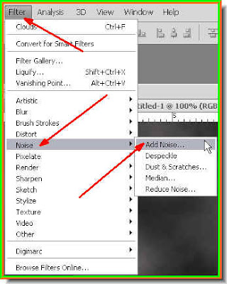 Step 5 : Go to Filter>Noise>Add Noise.
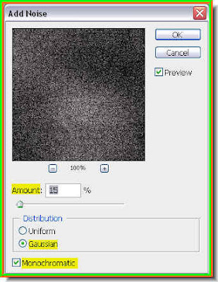 Step 6 : In the Add Noise dialogue box I have set the Amount at 15 %, I have checked Gaussian and Monochrome. A too high percentage in the Amount may not be necessary. Click ok.
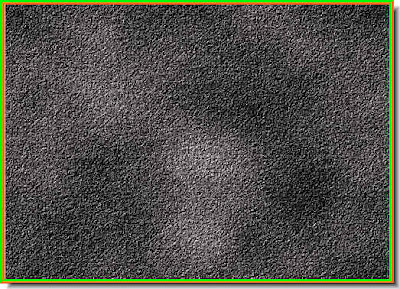
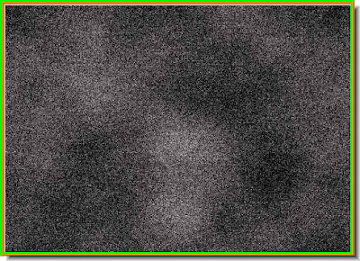 This is how the texture look like.
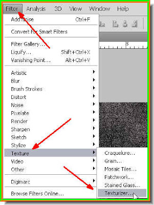 Step 7 : Go to Filter>Texture>Texturizer.
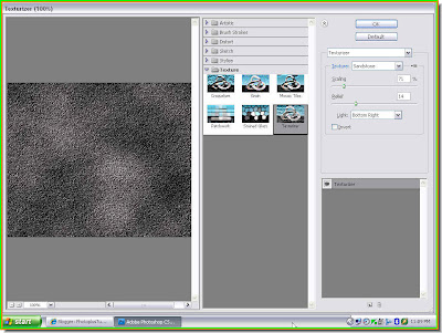 Step 8 : This huge dialogue box opens. You can see the Texture at left. The Controls are on the right top.
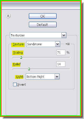 This is a closer look at the controls on the right. The Texture can be set from a drop down menu. The Scaling will determine the complexity of the dots. The Relief will increase the depth to make the texture look real. The Light determines from which angle the light comes.
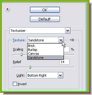 You can see the Textures available from the drop down menu. I have chosen Sandstone.
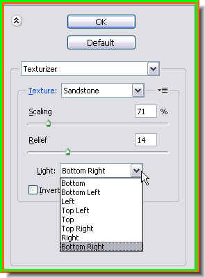
 This is how the Stone Texture looks. I will now add the lettering.
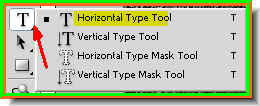 Step 9 : Click the Type Tool and choose Horizontal Type Tool from the flyout.
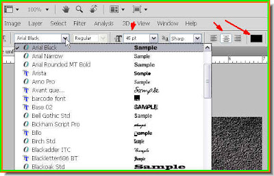 Step 10 : When you click on the Type Tool, look at the top panel. You can see the Fonts available from the drop down when you click where the white arrow points to. I have clicked on the Align Centre margin and chosen Black as the color of the Text. To choose the Size of the font, enter a value in the box.
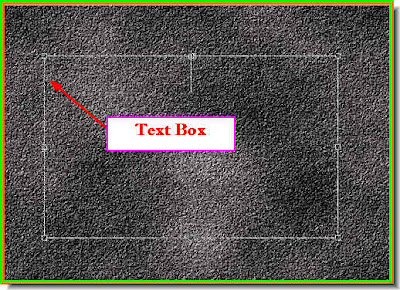 Step 11 : Draw out the text box with the cursor.
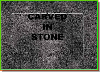
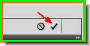 Step 13 : Click the Tick mark in the top panel to apply the transformatrion.
 Step 14 : Click the Move Tool.
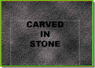 Step 15 : With the Move Tool I have repositioned the lettering. Now press CTRL+T. This is the Free Transform Command. A bounding box will form around the letters.
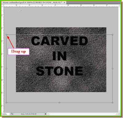

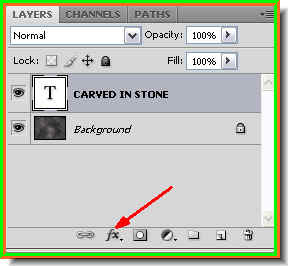 Step 17 : Look in the Layers pallette. You will find a Background layer which is the Stone Texture and the Text on its own layer above it. Now click the add Layer Style button. It looks a bit different in PS7, but is in the same place.
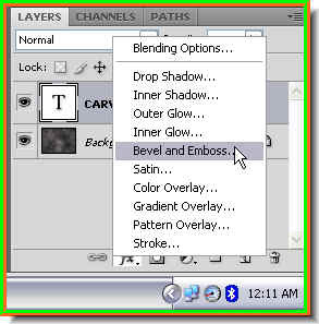
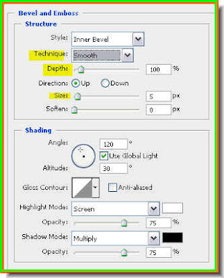 Step 19 : These are the controls of Bevel and Emboss. We will change the Technique, Depth and Size.
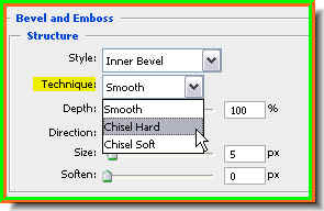 Step 20 : Change the Technique to Chisen Hard from the dropdown menu.
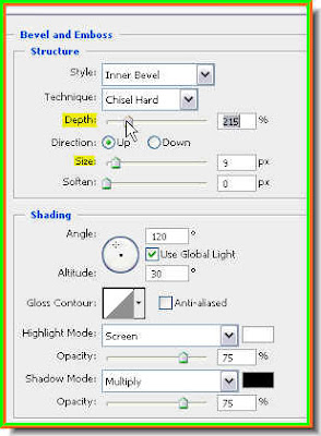 Step 21 : Drag the Depth slider to the right. You will be able to notice the change in the letters as you drag, then drag the Size slider slightly.
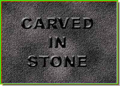 This is how the image looks. Though the letters now appear bevelled, they appear to be floating.
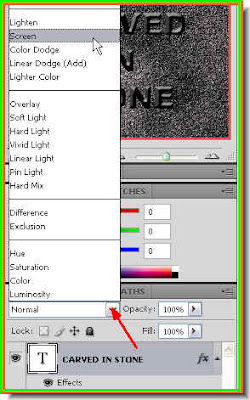 Step 22 : In the Layers pallete click where the arrow points to, to change the Blend Mode to Screen.
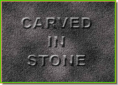
Now it looks as if the letters have been carved in stone. But some more fine tuning has to be done.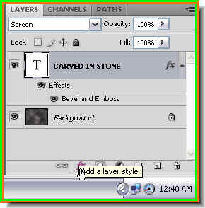
Step 23 : Click the Add Layer Style button again.
 Step 24 : From the popup click on Inner Shadow.
 Step 25 : Drag the Distance slider first and observe the effect, then drag the Size slider. Do not overdo it.
 Step 26 : Now change the Angle to make the light seem to come from the side or bottom. I have changed the Angle to -20.
 Step 27 : Now in the Layers pallette, just lower the Opacity. I have lowered it to 75%.
 Step 28 : Take an image of tree branches like this one.
 Step 29 : Press CTRL+SHIFT+U. This will desaturate the image.
Step 30 : Now drag the tree branch image onto the other image with the Move Tool.

Step 31 : If the image with branches does not quite cover the other image, press SHIFT+ALT and drag one of the corners till it covers the other image, then press Enter to apply the transformation.
 Step 32 : Change the Blend Mode to Soft Light.
 This is how the image looks. The shadow of the branches have to be blurred a bit to seem realistic.
 Step 33 : Go to Filter>Blur>Gaussian Blur.
 Step 34 : The Gaussian dilaogue box opens. I have set the Radius at 2.0 pixels. Too much will cause the shadowy branches to disappear. Click ok.
And this is the finished image. It looks as if moonlight has cast the shadow of the branches on the stone text.

My tribute to those who died in the Mumbai terrorist attack.
Tidak ada komentar:
Posting Komentar